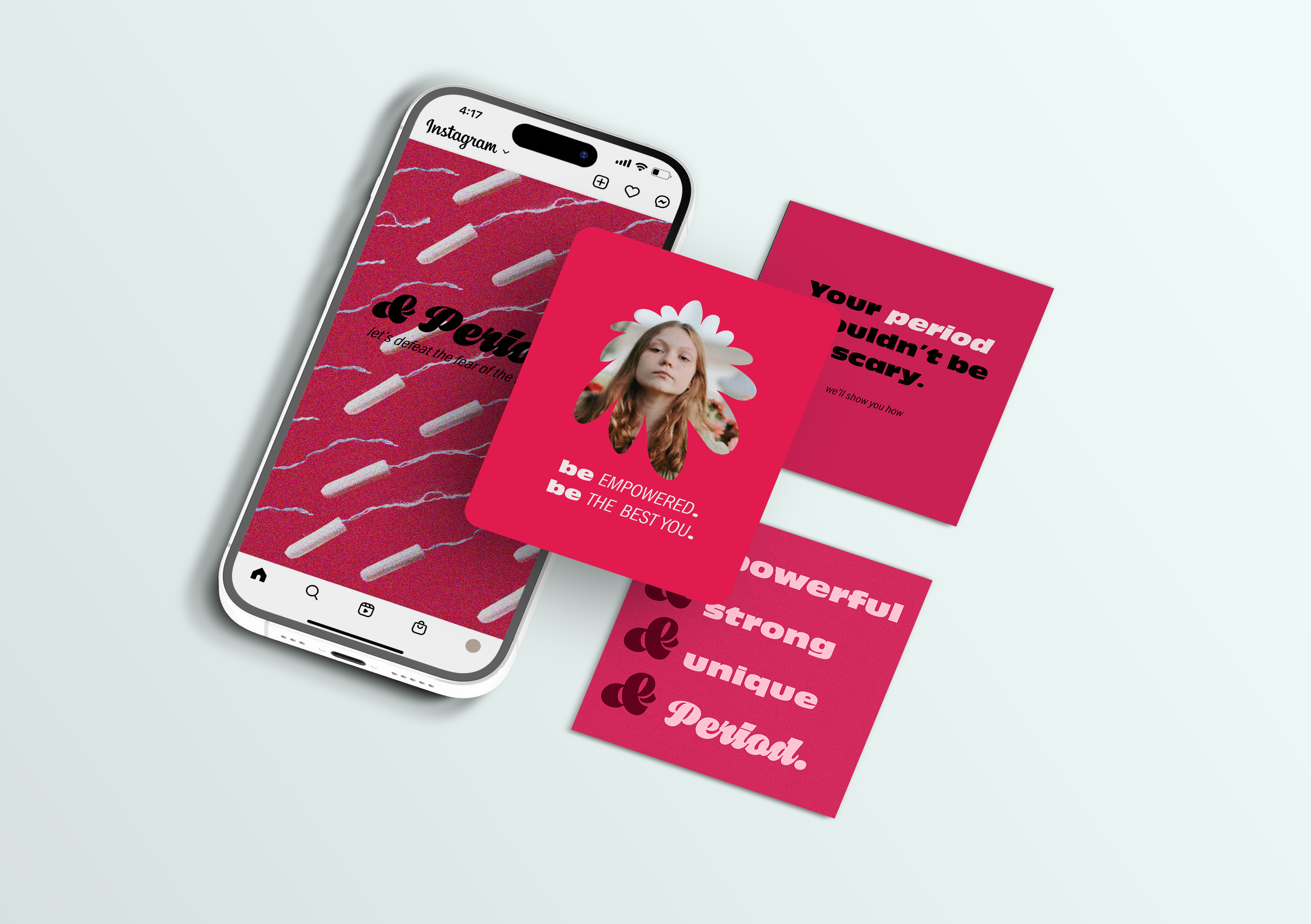
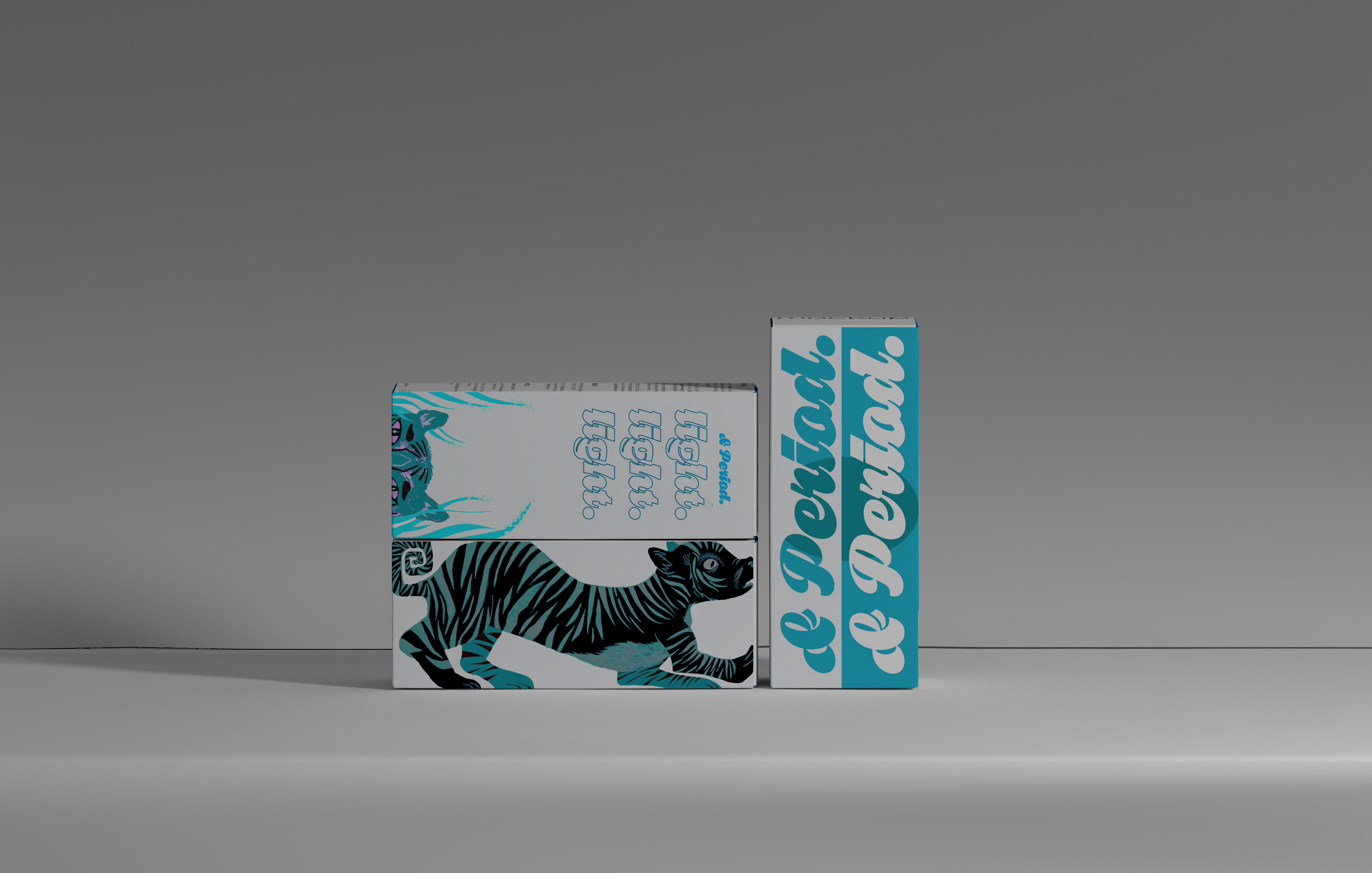
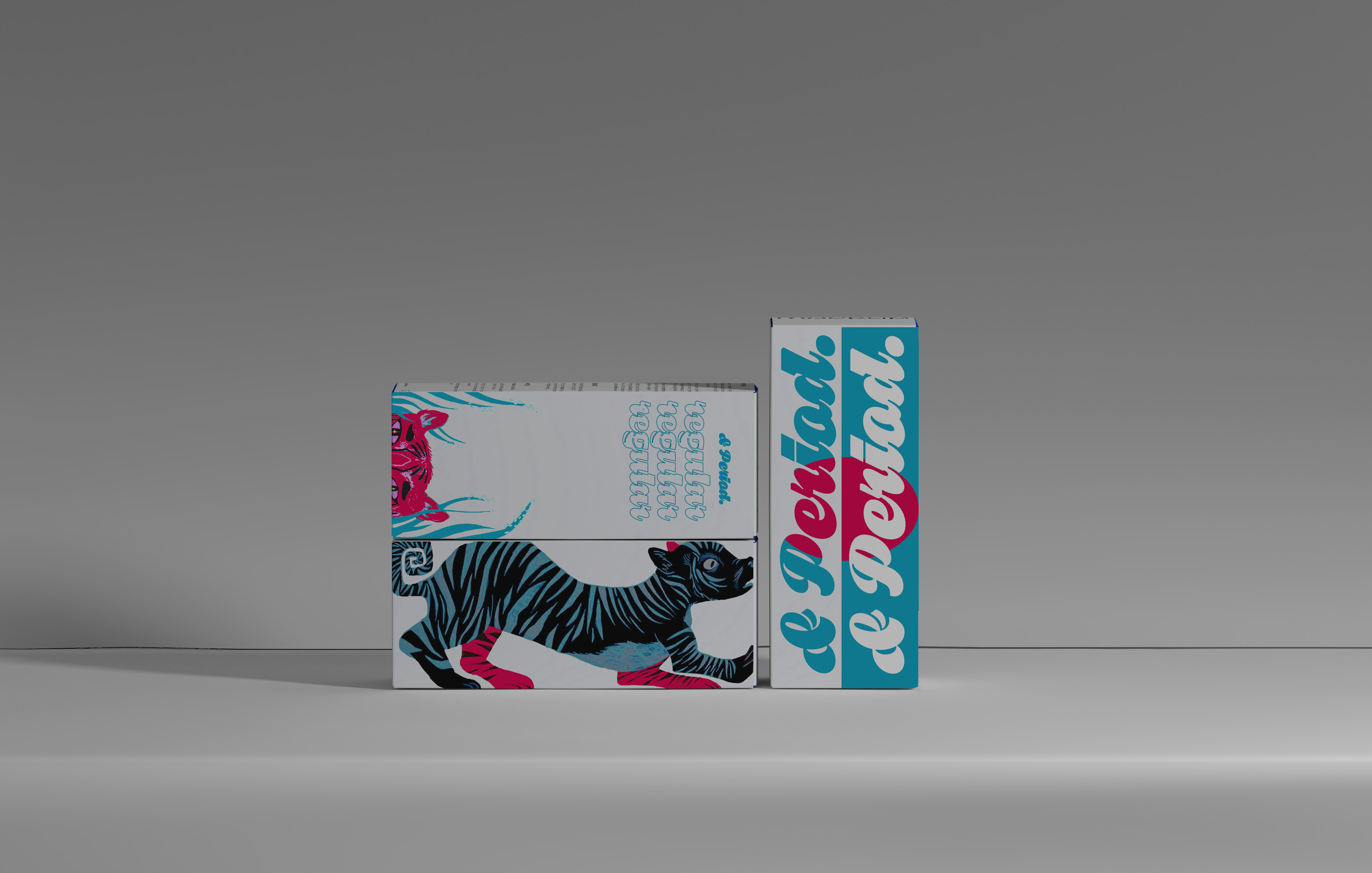
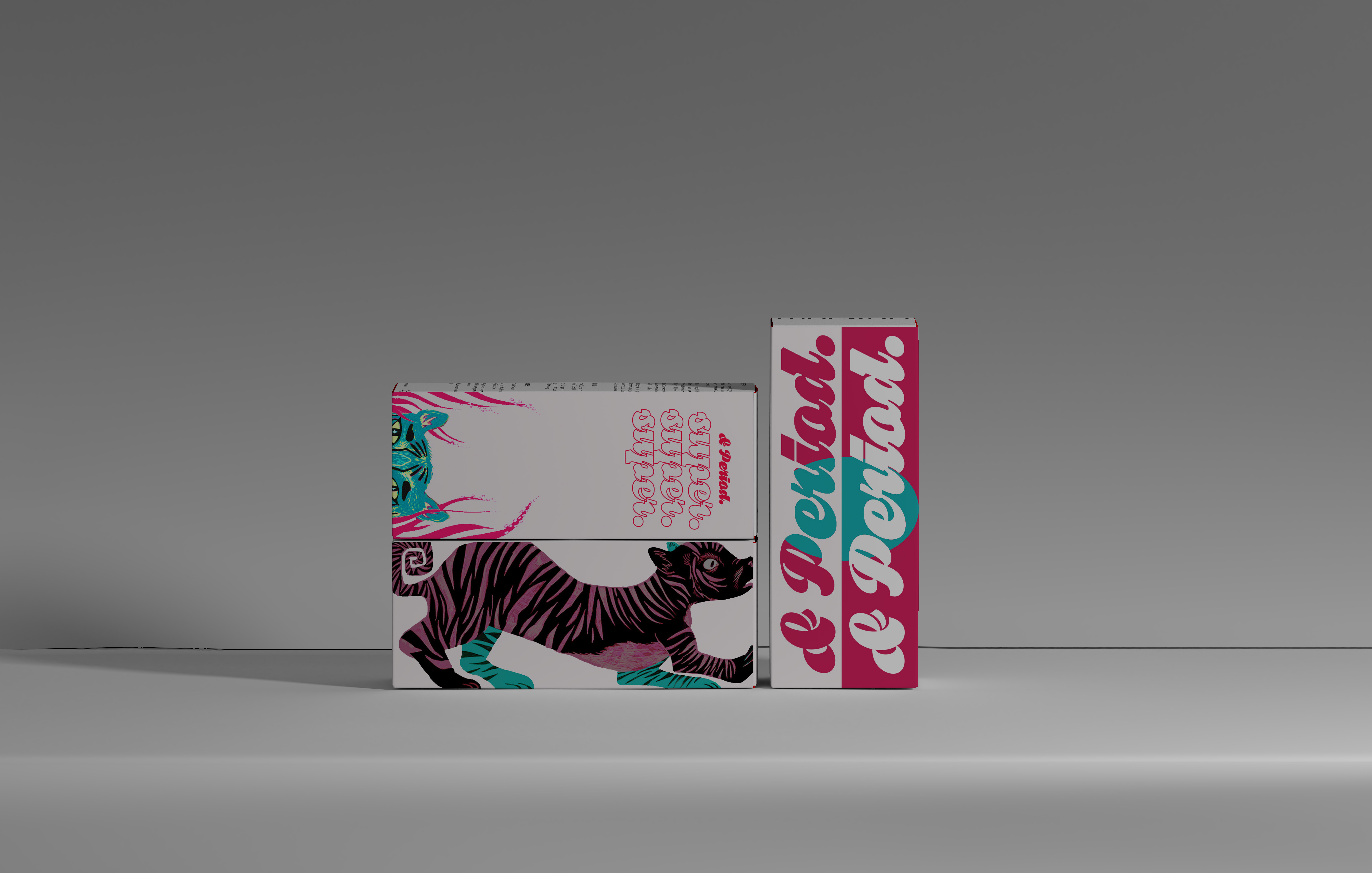
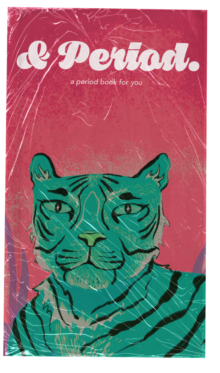
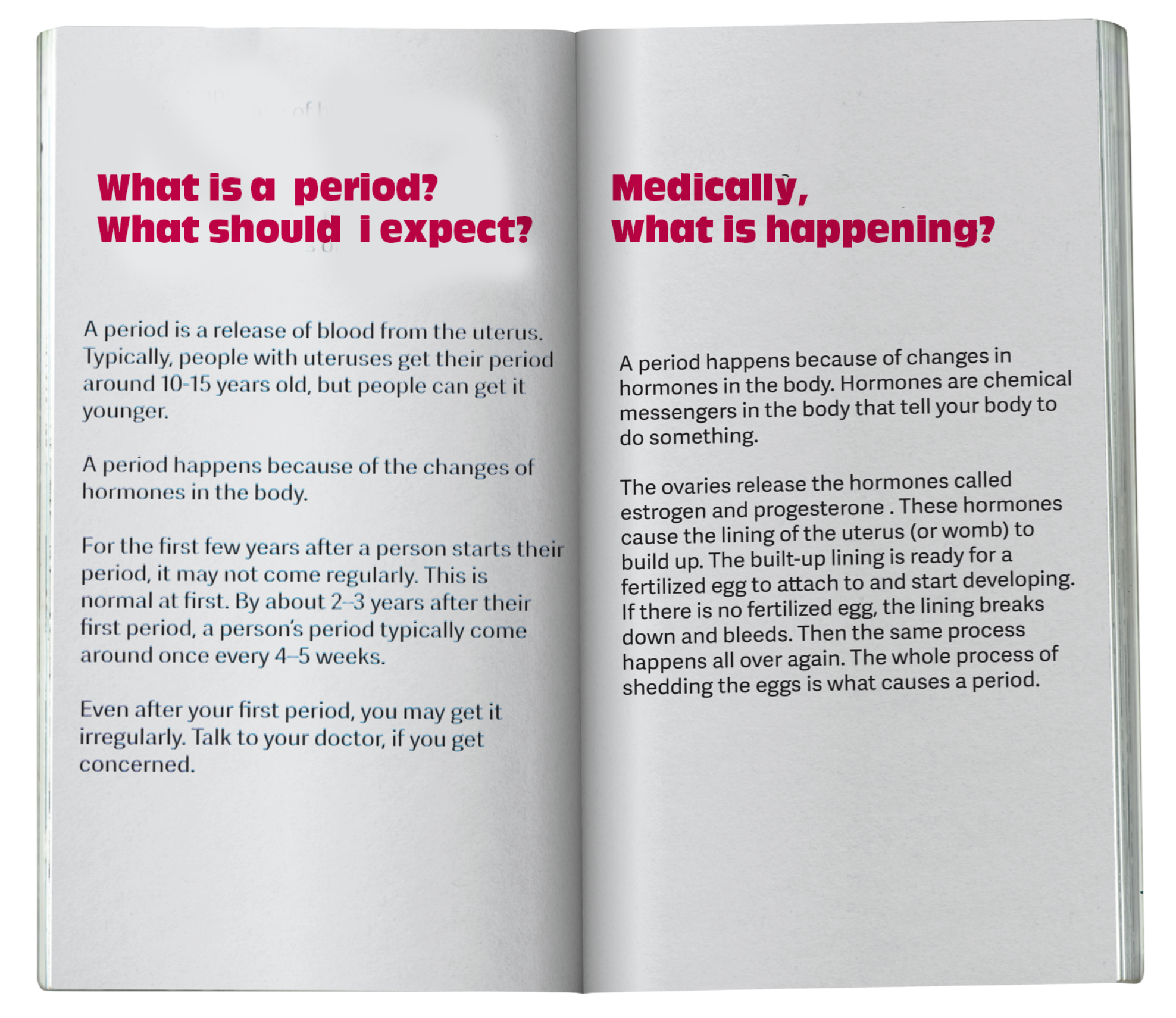
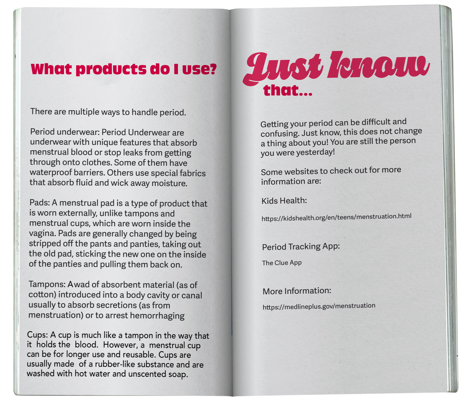
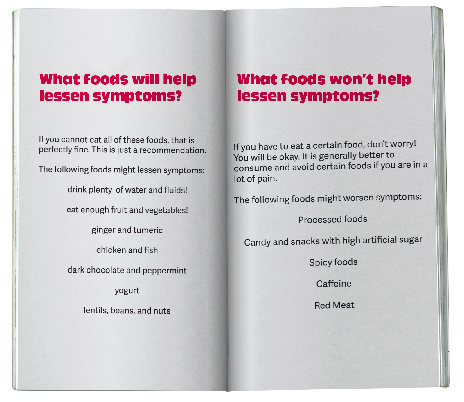
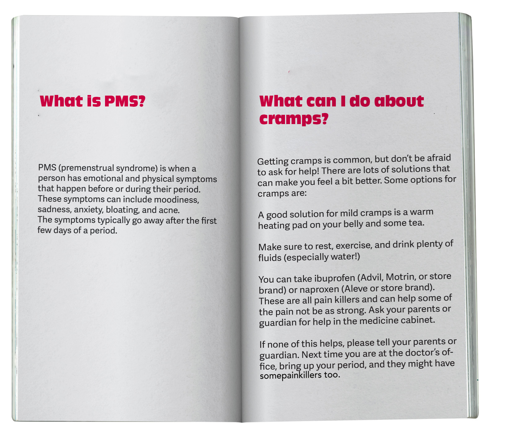
& Period
A period educational box striving to be gender inclusive, empowering, and most of all... for preteens.
Product Design
Designing for Kids
Packaging Design
Brief:
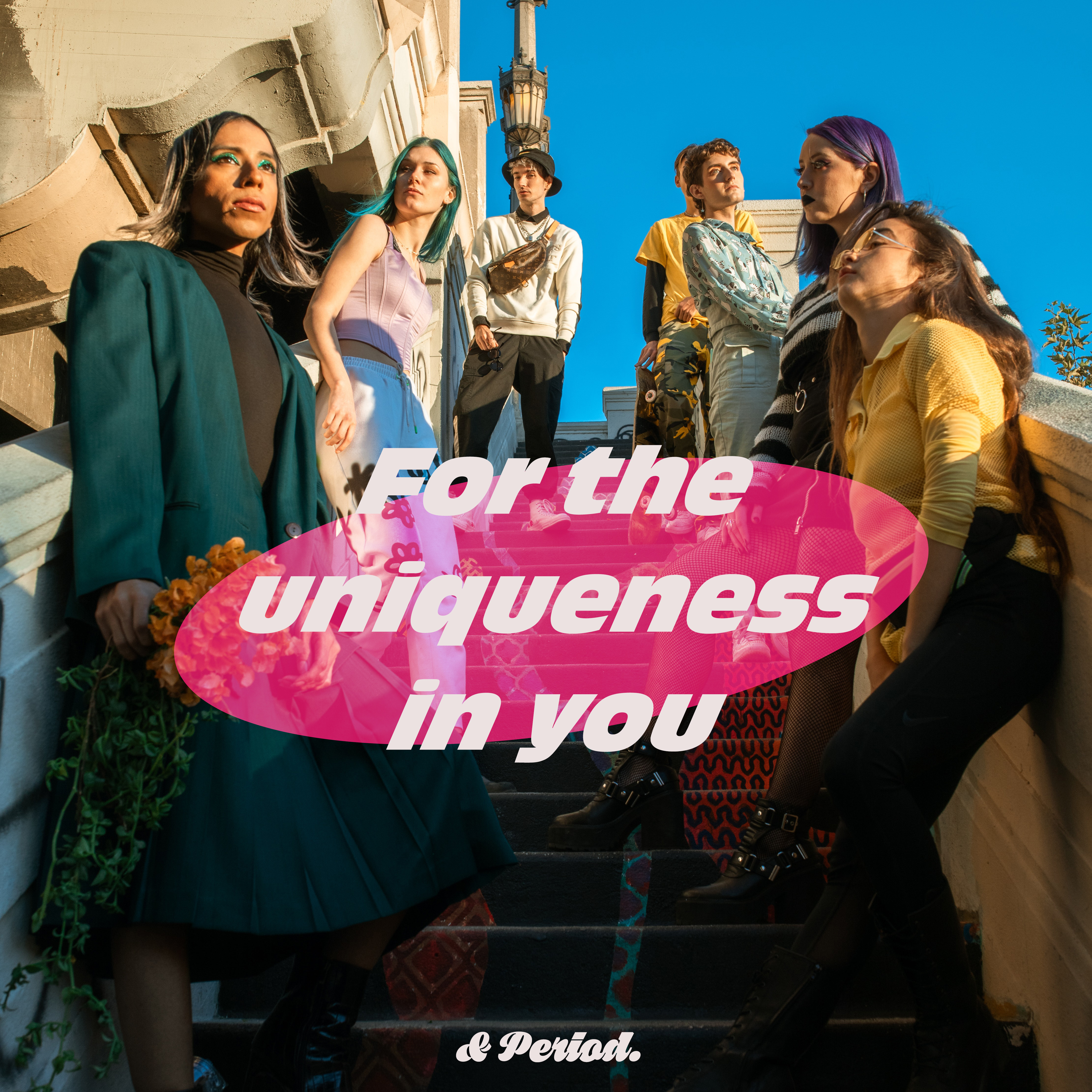
Create an educational children’s product that serves preteens period education and
materials.
Problem:
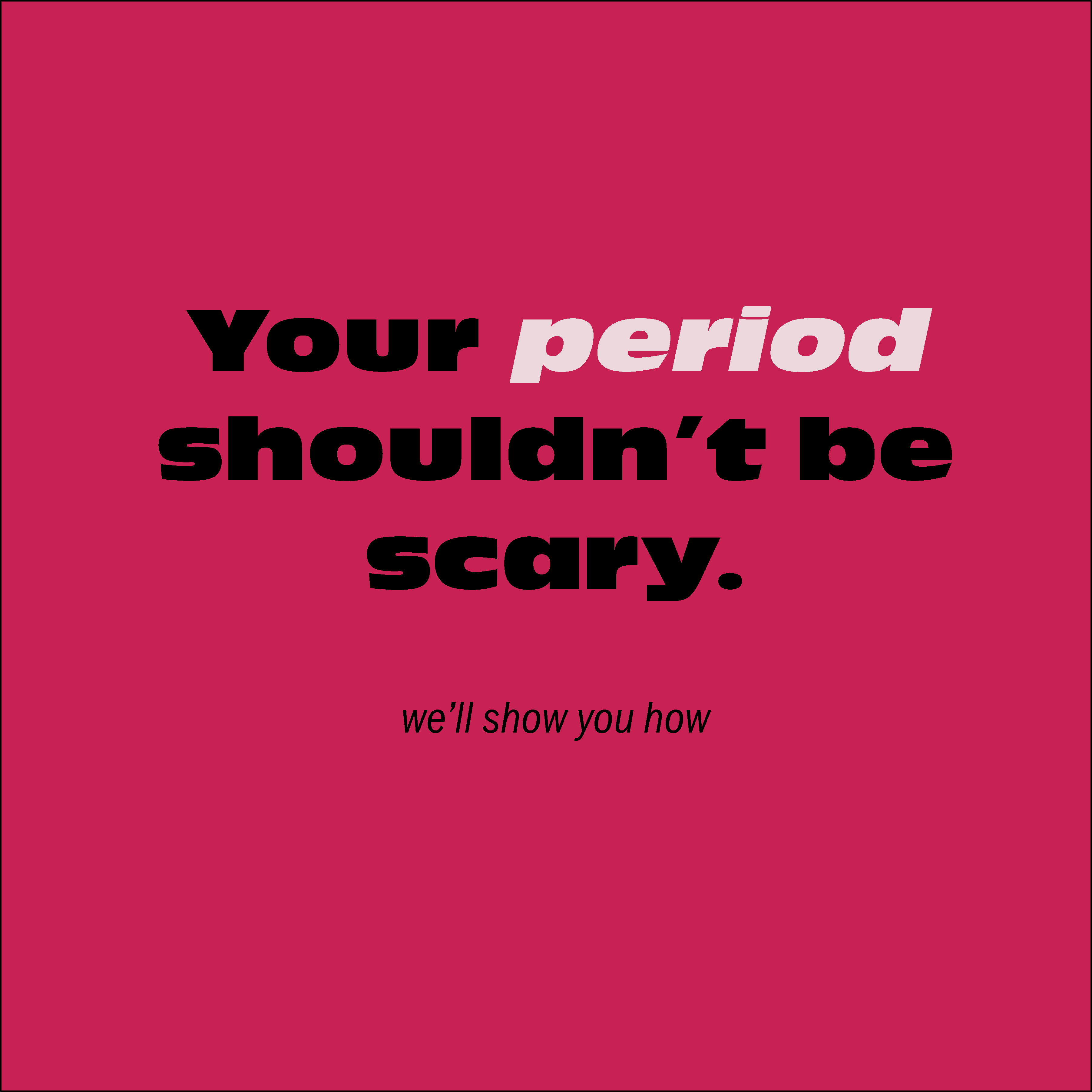
Period boxes are either being aged too mature to appeal to preteens or too gendered so not all kids can fully enjoy the products.
Solutions:
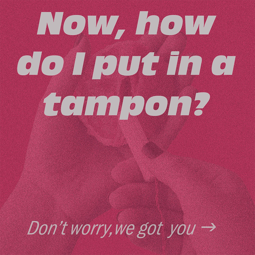
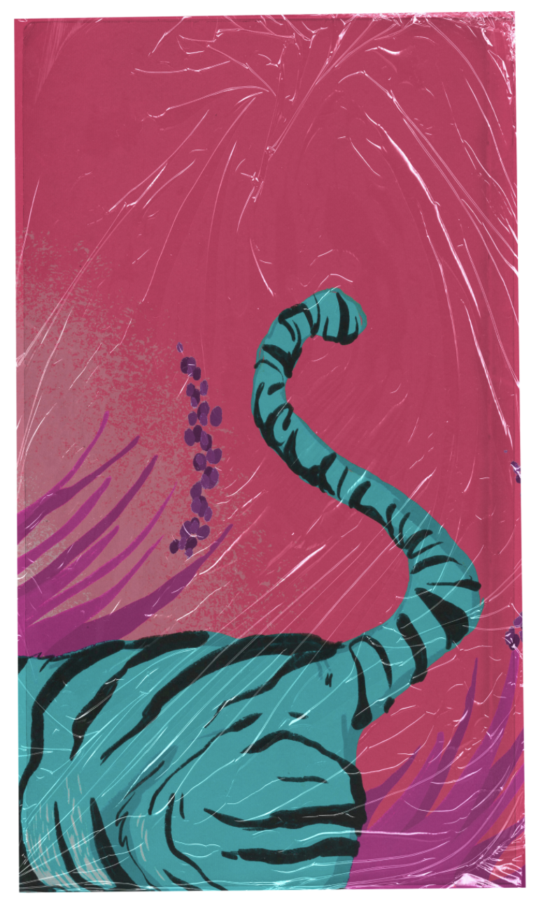
• Utilized colorful illustrations and fun typography to appeal to a younger audience.
• Used white spaces and unified color palette for different product lines to add consistency and a sleek feeling.
• Included nongendered language when discussing menstration education.
• Introduced a mascot for teens/preteens to project unto and identify with.
Period Box ︎︎︎

Tampons and Pads Line ︎︎︎

Educational booklet ︎︎︎
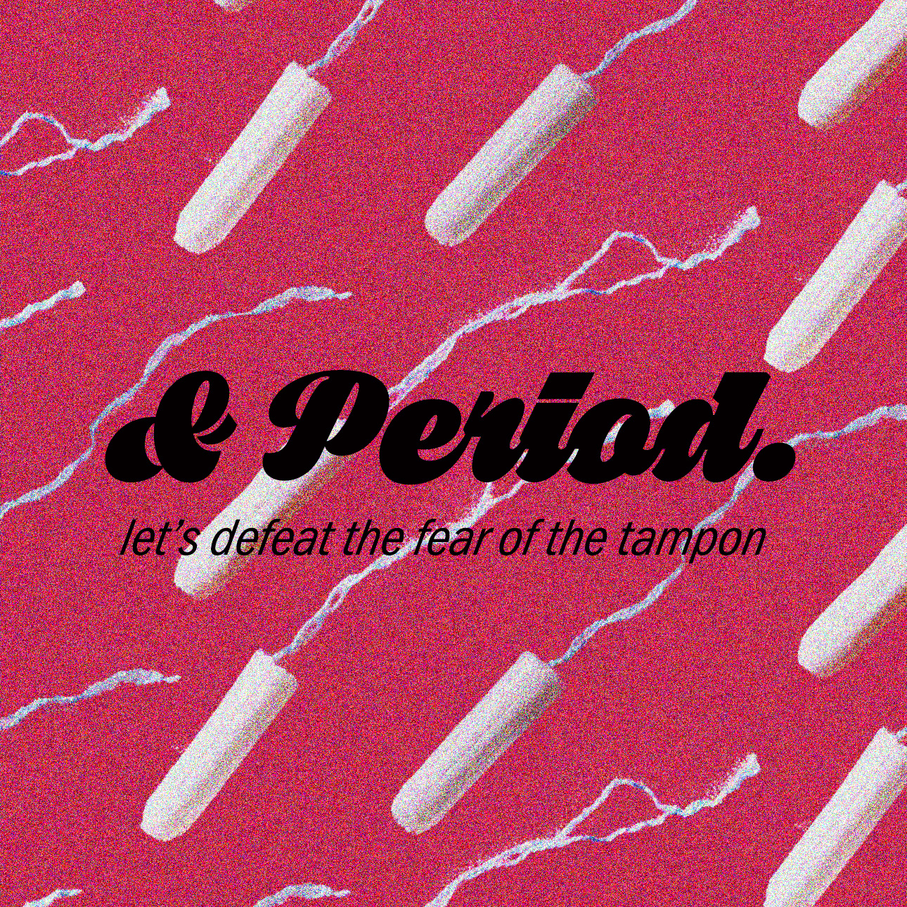
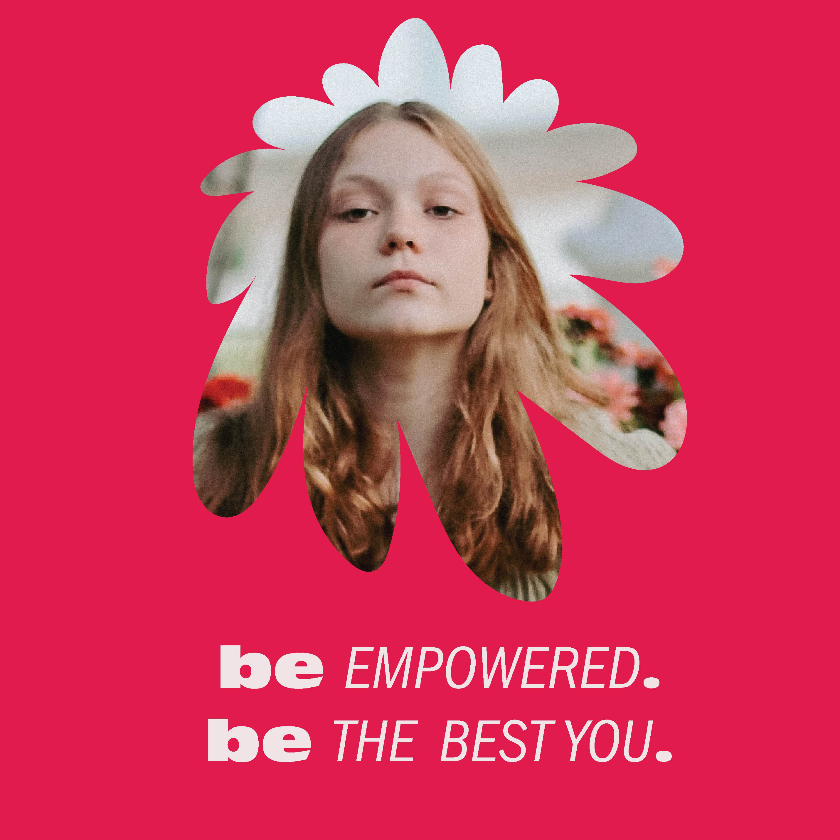
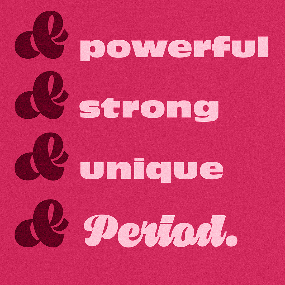
Social Media Posts ︎︎︎